Autumn, a welcome respite from the long, hot days of Southwestern summers.
When we think about Autumn, rich hues of eggplant, golden yellows and deep rusty oranges fall to mind. Enter crisp, cool winds and the warmth of Autumn Maple as a color trend for the equinox. A quintessential hue that blends tawny and russet shades, infusing any home with a dash of energy and vitality kicking off the festive holiday seasons ahead.
Autumnal orange is the color bringing thoughts of amusement, extroverts, and activity. The warmth of a fire, and tastes and aromas that are cheerful reminiscent of Halloween and Thanksgiving, radiating confidence that the holidays will soon be upon us.
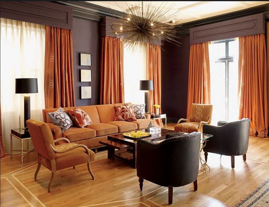
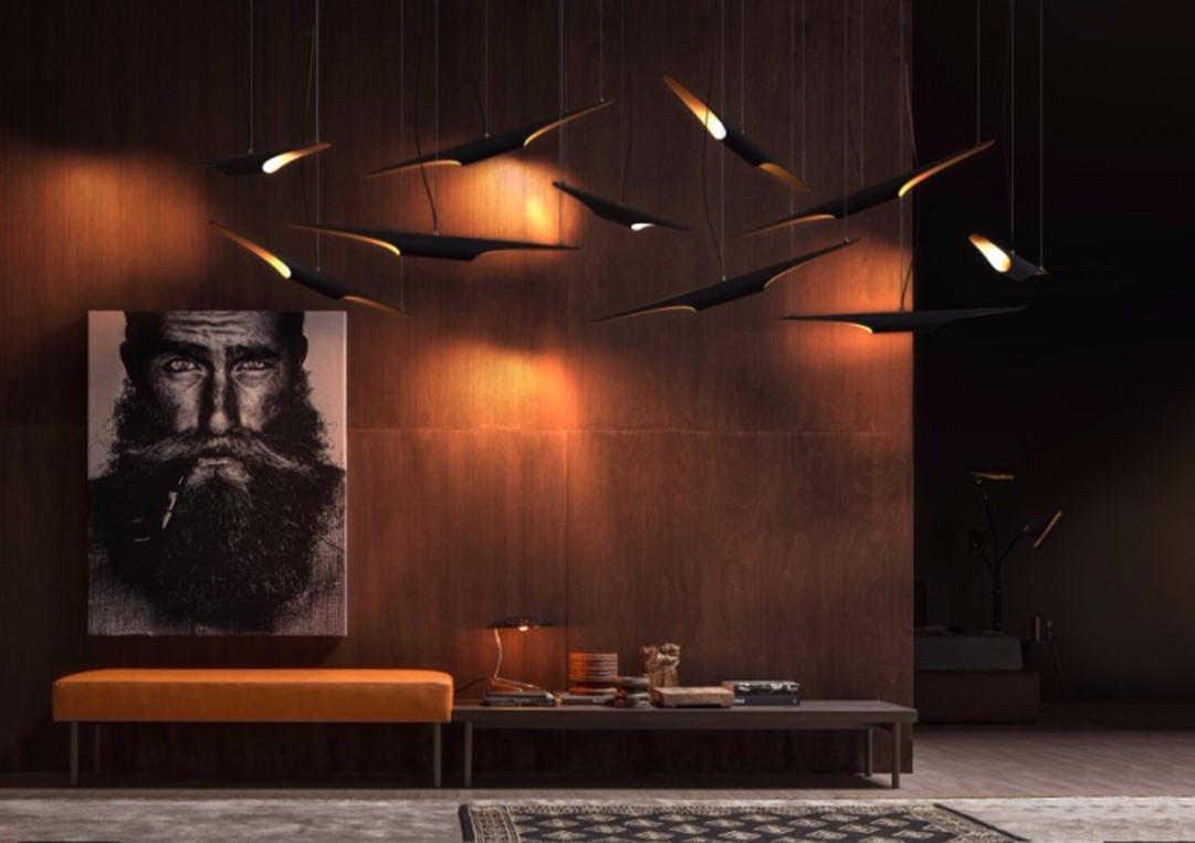 Delicious, rich brown undertones, Autumn Maple promises to make a dashing declaration in 2018 trends, whether through small touches or expansive statements. Transform any room into a hospitable and totally striking haven while being totally on trend.
Every color has a meaning and a therapeutic action. Amber tones are known to counteract depression, stimulate the intellect, and generally promote a positive mental state. This is why we view orange hues as happy and exciting. You can choose to paint almost any room of your house Autumn Maple or in a shade of this warm, welcoming hue. If you prefer a more conventional color on your walls, use gray or brown as your base and opt for shades of earthy orange in furniture, curtains, or decorative objects. Whatever color combination you choose, the room will always radiate with the presence of Autumn Maple.
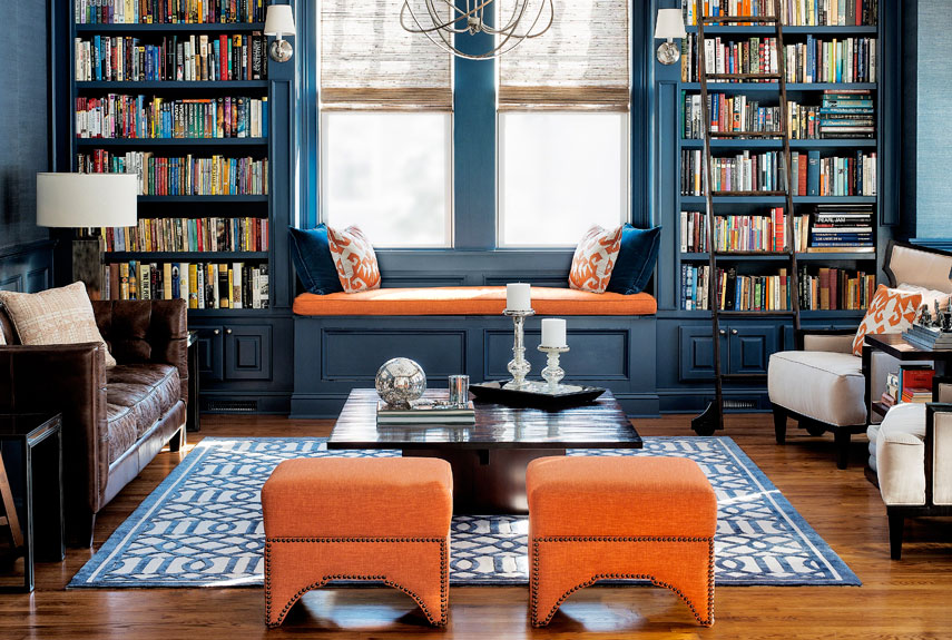
Spirited Autumn Maple may not be an easy color to work with for the timid, especially when striking a strong statement. Start small and, when you feel comfortable, work your way up. Autumn Maple can also look wonderful in a resourceful palette made up of complementary Navy Blue with pops of this rusty hues. “This is quite an interesting color combination,” said Eiseman. “It combines warm and cool tones that you just can’t avoid looking at.”
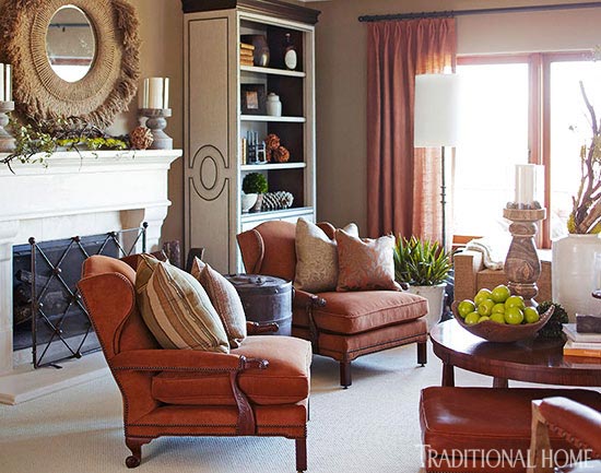
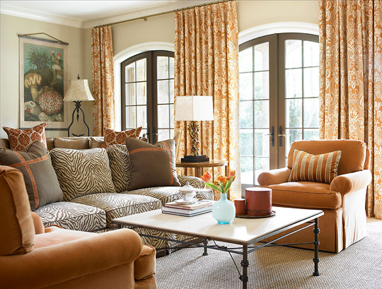
Autumn Maple takes a sophisticated turn when paired with tawny browns and creams in this fireside sitting area. The warm palette of this Napa Valley Showhouse room was inspired by the surrounding vineyards at harvest. “Our palette is congruent with views of the rolling hills right outside,” says designer Annie Bowman.
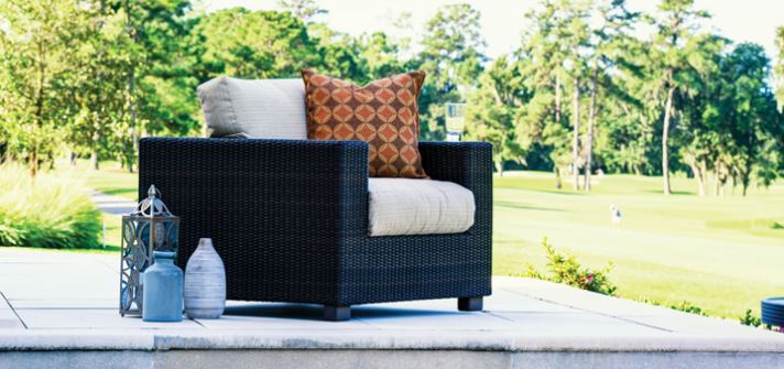
Vibrant tones can amp up the energy when introduced outdoors. This neutral wicker seating is complemented by a pillow in a distinctive brown, orange and red pattern. Textural details in deep browns ground the brighter elements of the palette, allowing the orange hues to take center stage against the beautiful backdrop.
Keep the energy flowing with both fun and function by introducing fabrics in durable Ultrasuede and bringing those outdoor Sunbrella fabrics into family spaces.
 Interior design: Mark Williams
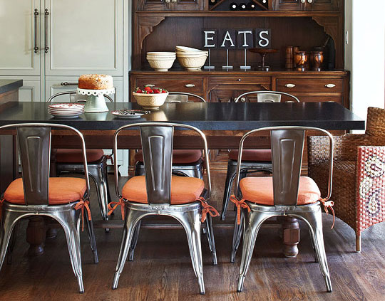
Some of the best designs embrace juxtapositions of materials and styles. The traditional architecture imbues a classic charm to this irresistible kitchen. Paired with its counterpoint, tensile modern metal chairs and adventurous Autumn Maple tie-on cushions.
Well-placed orange accents can infuse a home decor with warmth, optimism, and energy, making any room look more cozy and earthy.
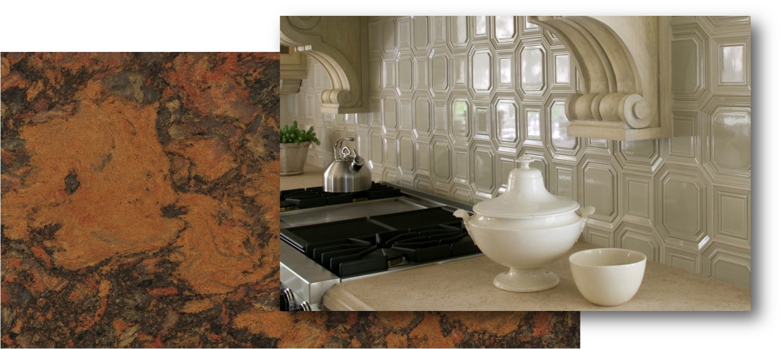 Cambria: Aberdeen™ | Waterstone Collection™ and Walker Zanger: Studio Moderne™ Marquis Octagon and Rectangle Pattern in Mica
Aberdeen is a show-stopper by Cambria. Hosting an energizing array of free-flowing and lava-like medley of oranges, greens, and grays, Aberdeen paired with a tasteful toasty neutral, brings class and texture into an easy yet sophisticated display.
Autumn Maple is not only a color loved in interior design but also in fashion. Clearly, it is the Fall approved color that will make any outfit or space look trendy and refined. Definitely a must-have trend of 2018!
Want to see other design trends coming up for 2018? Stop by our inaugural Luxury Design Showcase, to see how our talented team of designers are using the latest trends to make over a local Arcadia home!
Leave a Reply
You must be logged in to post a comment.